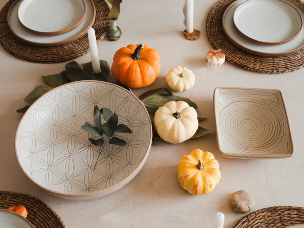
Autumn is my favourite season for tablescapes: the light softens, the days invite lingering dinners, and I love the quiet way simple objects can make a meal feel intentional. For a table of four, I often aim for a minimalist centerpiece that suggests the season without cluttering the table or distracting from the meal. At Thukthaeshop I rely on ceramics more than flowers — they feel grounded, tactile and endlessly layered. Here I’ll share which three Thukthaeshop ceramics I mix to build a minimalist autumn centerpiece, why they work together, and practical tips for arranging them so your table looks effortless.
Which three ceramics I choose and why
When I design a centrepiece for four, I look for pieces that balance scale, texture and tone. My pick is a trio made of:
These three types — bowl, vase, tealight holders — cover the main visual needs of a minimalist autumn centrepiece: a base for seasonal accents, a vertical element for line and movement, and points of warm light. I try to keep all pieces within the same material family (stoneware or earthenware) so the finishes relate to one another even if the glazes differ slightly.
How I select colours and finishes
People often ask: “Should all ceramics match?” My answer is no — but they should harmonize. I prefer a palette of three related tones: a medium warm base, a cooler accent and a dark grounding shade. For example:
Matte glazes read quieter and more autumnal than glossy finishes. I love the handmade look — subtle ridges or speckled clay make the objects feel curated rather than store-bought. If you have one piece with a slightly textured glaze, balance it with two smoother forms to avoid visual competition.
The practical arrangement for a table of four
On a dining table meant for four, centrepieces should be low enough to allow eye contact and narrow enough to avoid obstructing elbows. Here’s how I arrange the three ceramics:
This triangular arrangement (bowl, vase, lights) gives rhythm and a natural flow. I deliberately leave negative space so the centrepiece breathes — minimalism is as much about what you remove as what you add.
What I fill the bowl with — seasonal ideas that stay minimal
Filling the bowl is where you bring autumn in without overdoing it. Avoid full bouquets or obvious clichés. Here are things I use:
One of my favourite looks is a shallow bowl with three muted gourds and one small sprig of dried grasses laid across them. It’s succinct, textural and easy to switch out between meals.
Lighting: why ceramic tealight holders matter
People often underestimate the role of low light. Tealights in ceramic holders create a soft, flickering glow that makes an intimate dinner feel special. Ceramic diffuses the flame subtly — a matte dark holder makes the flame pop without becoming showy.
For safety, always use a small glass insert for tealights if the ceramic holder is very shallow or porous. I also recommend LED wax tealights with flicker function if you want the effect without open flame, especially when kids are at the table.
Scale and proportion guide (quick reference)
| Piece | Typical size I use | Why |
| Low bowl | 20–25 cm diameter, 5–8 cm high | Provides a base for accents without blocking view |
| Tall vase | 15–25 cm high, 6–9 cm diameter | Creates vertical interest and visual rhythm |
| Tealight holders | 4–6 cm high, 5–7 cm diameter | Small points of light; easily moved between dinner courses |
Common questions and my answers
Q: “Can I use these ceramics on a narrow table?”
A: Yes. Use a smaller bowl (15–18 cm) and keep the vase slim. Place the trio lengthwise so people on the long sides don’t have to reach around it.
Q: “What if I don’t have tealight holders?”
A: Use a single low ceramic cup or small ramekin with a tealight placed inside a glass votive. The important part is low, warm light positioned near the bowl.
Q: “Do the ceramics need to match my tableware?”
A: Not exactly. I like a subtle echo: if your plates are speckled cream, choose a bowl in a warm clay tone. Contrasts are fine — a dark charcoal holder looks chic against light plates — but keep the overall palette limited to three or four tones.
Styling variations I rotate through
I often change the mood by swapping a single element:
These small swaps keep the centrepiece fresh without reorganising the whole table.
If you’d like, I can recommend specific Thukthaeshop pieces that match the descriptions above — tell me your table dimensions and whether you prefer clay, grey or green tones, and I’ll pull a short edit for you.