Creating a cohesive color story across pillows, throws and art is one of my favorite styling challenges — and one that can instantly make a room feel thoughtful, layered and complete. Over the years I’ve learned that color cohesion doesn’t mean everything must match perfectly. Instead, it’s about a deliberate dance between harmony and contrast: choosing a small set of related tones, repeating them in different materials and scales, and letting texture and pattern do much of the heavy lifting.
Start with a simple palette
The easiest way to avoid a mismatched look is to begin with a limited palette. I usually pick three main anchors: a neutral base, a dominant color and an accent. For example:
- Neutral base: warm beige, soft grey or a creamy off-white.
- Dominant color: a calming blue, muted green or terracotta.
- Accent: a brighter hue like mustard, deep navy or a rosy terracotta.
This trio gives me structure. The neutral keeps things livable, the dominant color ties pieces together, and the accent injects personality without overwhelming the room.
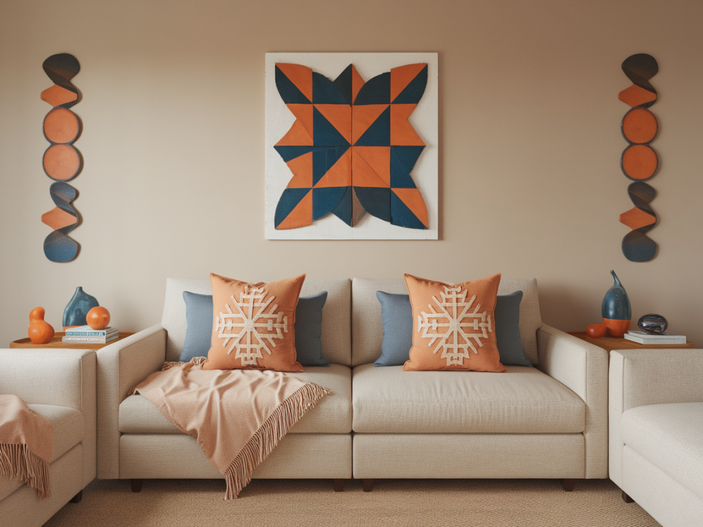
Use art to set the tone
I like to choose a piece of art first — not always, but often. A painting or print can provide an organic palette and proportions between colors that are already proven to work together. When I find a piece I love (sometimes from a maker featured on Thukthaeshop), I pull three to five tones from that artwork and use them as anchors for textiles.
If you don’t want the art to dictate everything, use it as inspiration rather than a rule: match the warmth or coolness of the painting, the weight of the darkest tone, or the punch of the brightest accent. Sometimes a monochrome print allows more freedom, in which case I rely on textiles to bring in color.
Think in terms of ratios
Colors read differently depending on how much of them you see. I often use a simple ratio to guide placement: 60–30–10. Sixty percent of the room’s visible textiles are the neutral base (large throws, a main rug, big linen cushions); thirty percent is the dominant color (a couple of pillows, a patterned throw with the dominant hue woven in); ten percent is the accent (a small cushion, trim, or an art detail).
This rule helps keep the eye moving and prevents a single color from overpowering the scheme.
Layer textures and materials
Texture is the secret sauce. Two cushions in the same color can look completely different if one is boucle and one is linen. When I put together a group of pillows, I always vary:
- fabric (cotton, linen, wool, velvet, silk)
- finish (matte vs. sheen)
- scale of pattern (large geometrics, small checks, subtle slub)
- construction (knits, handwoven, embroidered)
Throws are a great place to extend color while adding a different touch: a chunky knit throw brings bulk and coziness; a lightweight embroidered throw adds detail. I’ll often pick a throw that repeats the dominant color in a different texture so the set reads layered but harmonious.
Mix patterns confidently
Pattern mixing is where many people hesitate, but it’s one of the most effective ways to build cohesion. Follow these practical rules I use often:
- Vary scale: combine a large-scale motif, a medium one, and something small or textured (like a plain velvet).
- Repeat a color: make sure at least two patterns share a common color — that acts like a visual handshake between pieces.
- Anchor with neutrals: patterned pieces look intentional when balanced by plain cushions in neutral tones.
For instance, pair a large floral cushion that contains navy and rust with a medium-scale stripe in navy and a small geometric cushion in rust. The repetition of navy and rust across scales makes the group feel curated rather than chaotic.
Consider scale and placement
Cushion sizes and placement contribute to the narrative. A typical sofa arrangement I use is 3–5 cushions: two larger cushions (50x50cm or 60x60cm) at the back, a medium one (45x45cm) and one or two smaller accent cushions (30x50cm bolsters or 40x40cm). Place the dominant color on the larger cushions and the accents in smaller sizes so the eye reads the big shapes first and then the details.
On a bed, I reverse the logic: put neutrals and large pillows at the back against the headboard, then layer color and pattern toward the front.
Use art placement to echo textiles
Once pillows and throws are in place, I reassess the art. Small adjustments — shifting a picture slightly left, hanging a print a few inches lower to align with the sofa cushions — can create a sense of alignment. If the artwork lacks color, a subtle solution is to install a shelf beneath it and place a small cushion or folded throw with the accent color there to create a tie.
Bring in metallics and neutrals as connectors
Metals (brass, blackened iron, matte chrome) and neutral accessories (rattan baskets, wooden trays) are excellent connectors. They don’t compete with color but they give the eye resting points. For example, a brass lamp with a cream linen shade can harmonize with warm tones in a throw without adding another color to manage.
Test on a small scale first
Before committing, I try combinations in miniature. Place a cushion on the sofa, drape a throw across the arm, and hold the art nearby. Live with it for a few days and observe at different times of day — natural light will change how colors read. If something feels off, swap one element rather than starting from scratch.
Practical sourcing tips
When I’m sourcing pieces, I prioritize artisanal textures and limited runs because small variations can actually enhance cohesion — they make the group feel collected rather than matched. Thukthaeshop carries many one-of-a-kind throws and hand-printed cushions that lend character and help build a layered color story. If you buy from larger brands, look for items in the same fabric family (linen vs. velvet) and intentionally mix finishes to add interest.
Final quick checklist
- Choose a 3-color palette: neutral, dominant, accent.
- Pick art that inspires your palette, or use art as a subtle guide.
- Use a 60–30–10 ratio to balance colors.
- Mix textures and vary pattern scales.
- Place larger cushions with dominant color, accents in smaller sizes.
- Use metals and neutrals to connect elements.
- Test arrangements for a few days and tweak.
Harmonizing pillows, throws and art is about creating a visual conversation — not forcing everything to match, but giving each piece a clear role. When you build with intention, small changes make a big difference in how your room feels: more pulled-together, layered and personal.